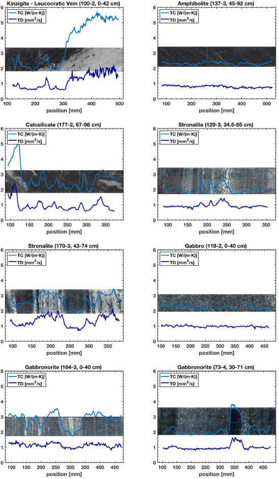
The temperature field in the Earth’s crust is one of the least constrained parameters, as there is no direct measurement possible beneath a certain depth, and as there is little data availabe on the properties of the relevant rocks. Thanks to the DIVE drilling project, we could sample, measure and characterize the thermal conductivity and heat production on a wide variety of rocks. These measurements, as the one on the figure below, connect the small-scale, mineral and rock properties, with the large-scale, crustal features. More details on these properties, and on their variability at various scales can be found in our fresh article by Lemke et al. (2026) published in the journal Geothermics.