Measuring power relations in Asia
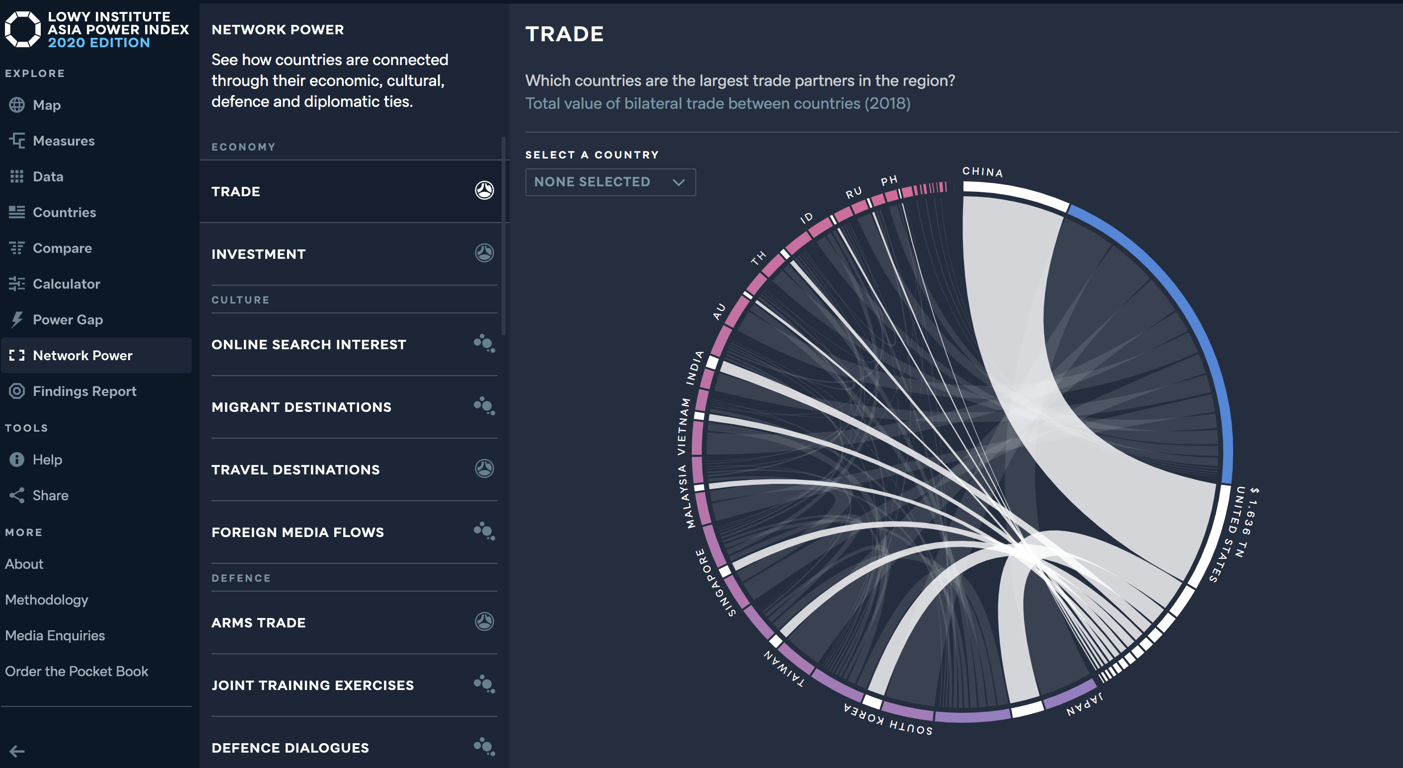
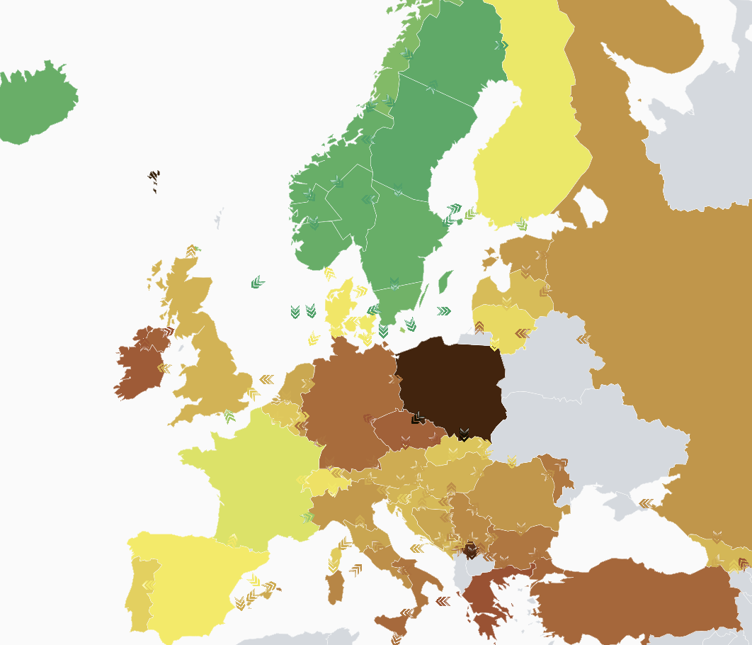
The annual Asia Power Index — launched by the Lowy Institute in 2018 — measures resources and influence to rank the relative power of states in Asia. The project evaluates international power in Asia...
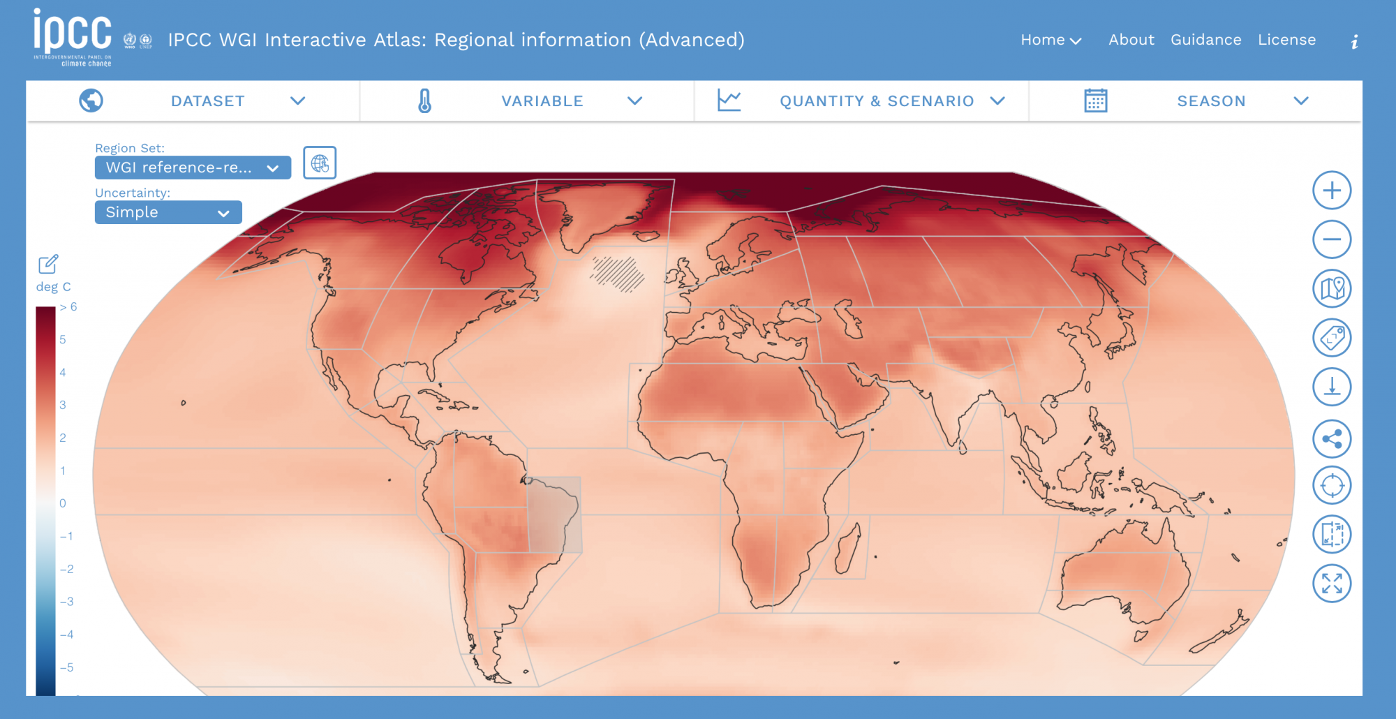
The IPCC has recently published their sixth assessment report on the physical evidence of climate change. The report has again confirmed evidence of climate change across all global regions, which will affect rainfall patterns,...
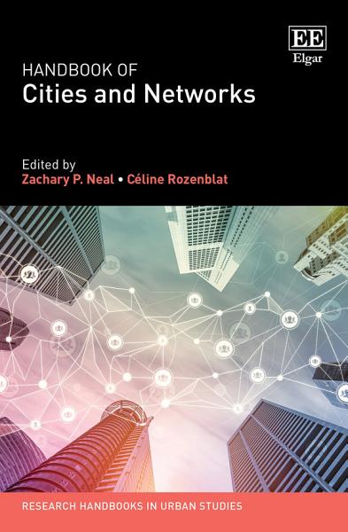
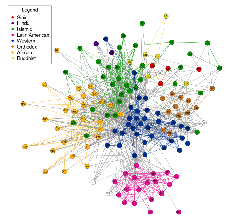
Edited by Zachary P. Neal, Associate Professor, Department of Psychology, Michigan State University, US and Céline Rozenblat, Professor of Urban Geography, Faculty of Geosciences and Environment,Université de Lausanne, Switzerland Publication Date: 2021 ISBN: 978...
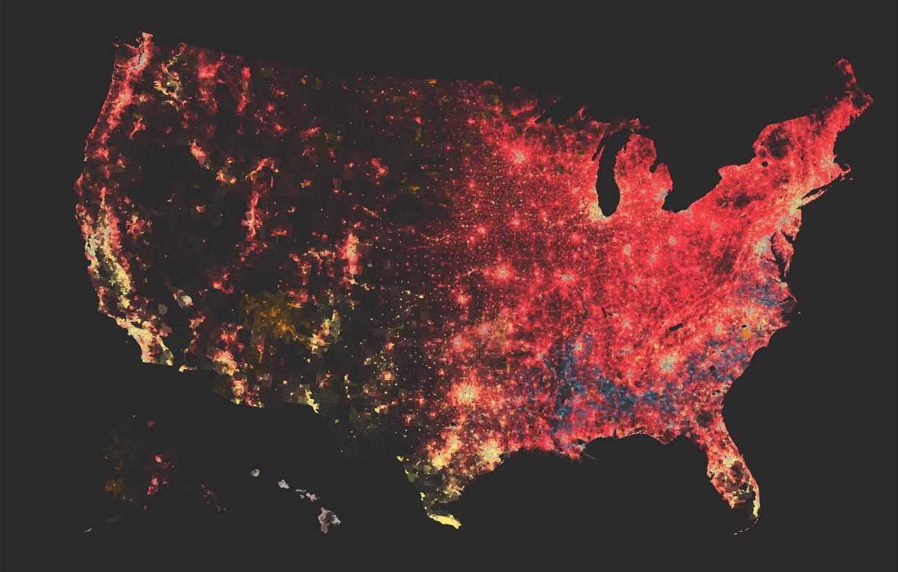
The Covid-19 pandemic has contributed to the daily use of graphics, dashboards and visualizations that helped make sense of its spread and global development. Data are increasingly available and easy to manipulate and diffuse....
Where does your electricity come from? Does your country’s energy portfolio rely mostly on fossil fuels like coal and gas or renewable sources like wind and hydro-electric? The web platform electricity map allows to answer...
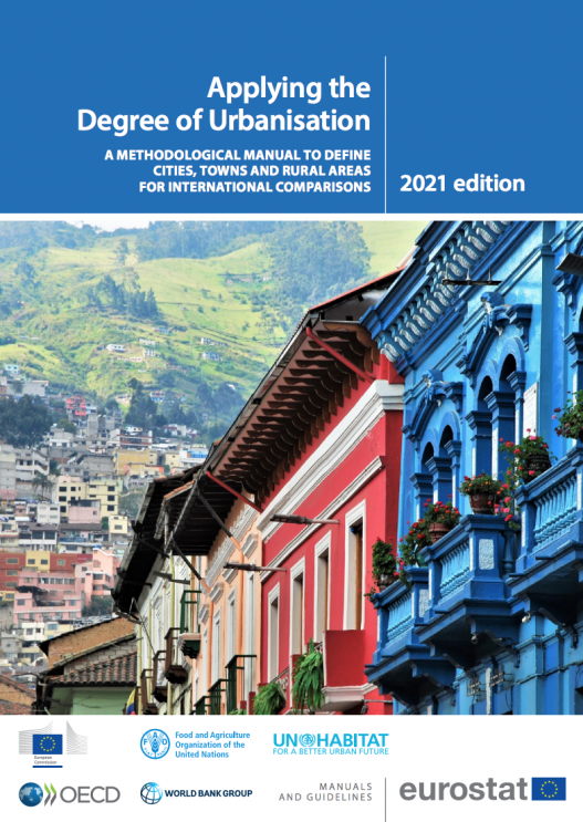
The definition of cities and their limits is always a challenging task. In fact, urbanization patterns are very diverse and they rarely match administrative subdivisions. Thus, if it is often difficult to define where...
An interesting network interactive vizualization of philosophy where lines and connections are more important than the proximity in the network… follow each line to know more about a philosophical (sometimes literature or artistic) domain...
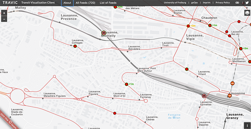
TRAVIC is a real-time tracker of public transport that allows the user to visualize the movement of trains, buses, trams and boats all over the world. It is based on a master thesis project by Patrick Brosi in...
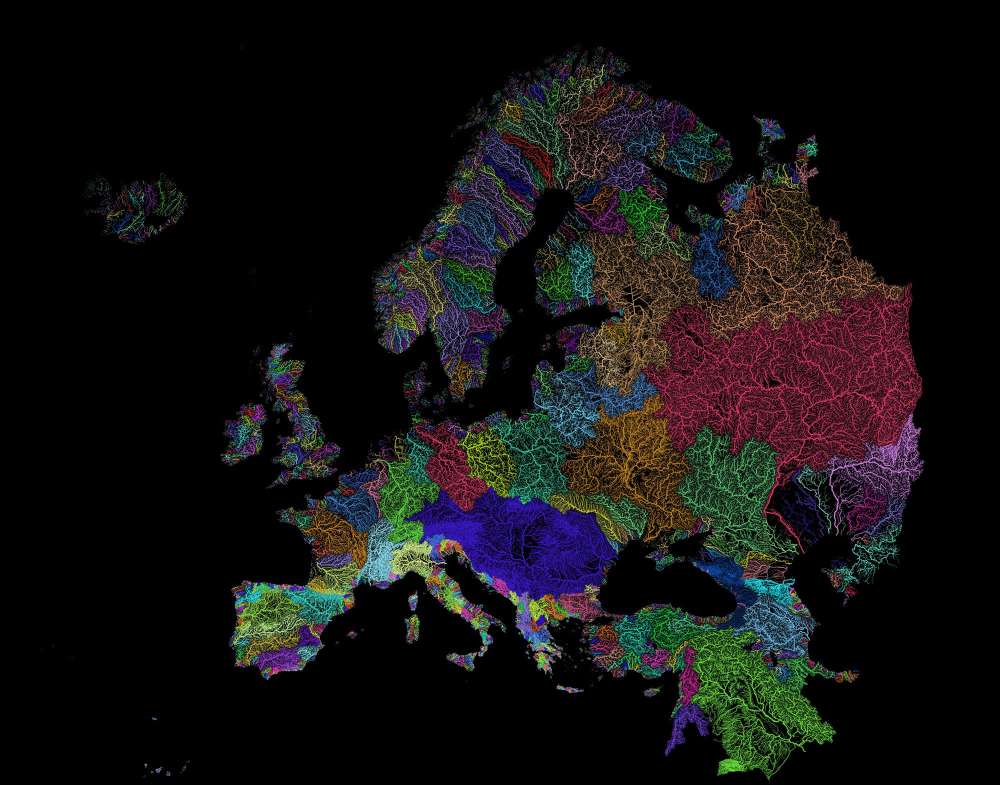
Rivers are fundamentals in creating the right conditions for life: that is why most cities since ancient civilizations were built along their banks. Rivers form intricate networks linking the main branches and their smaller...
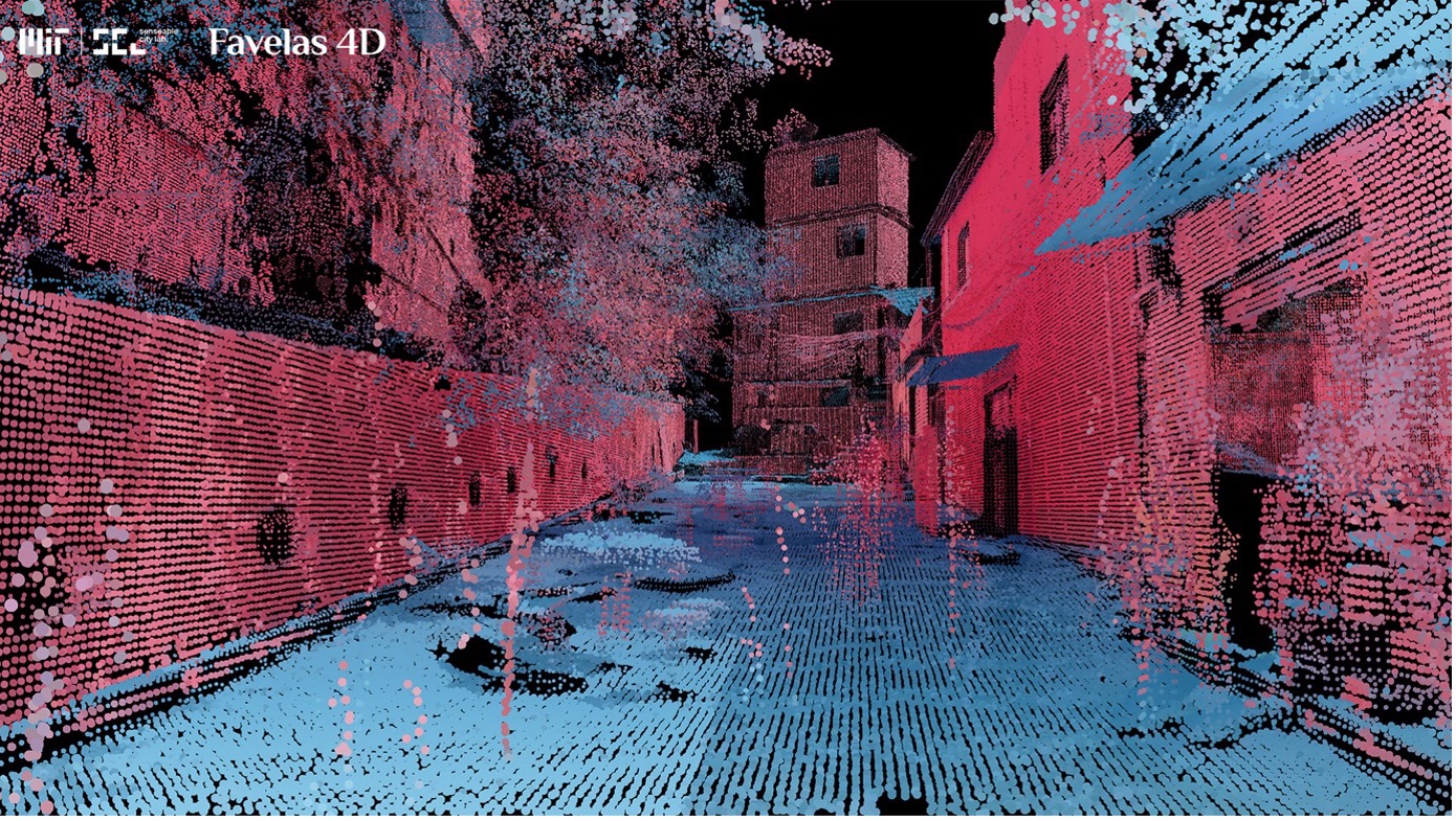
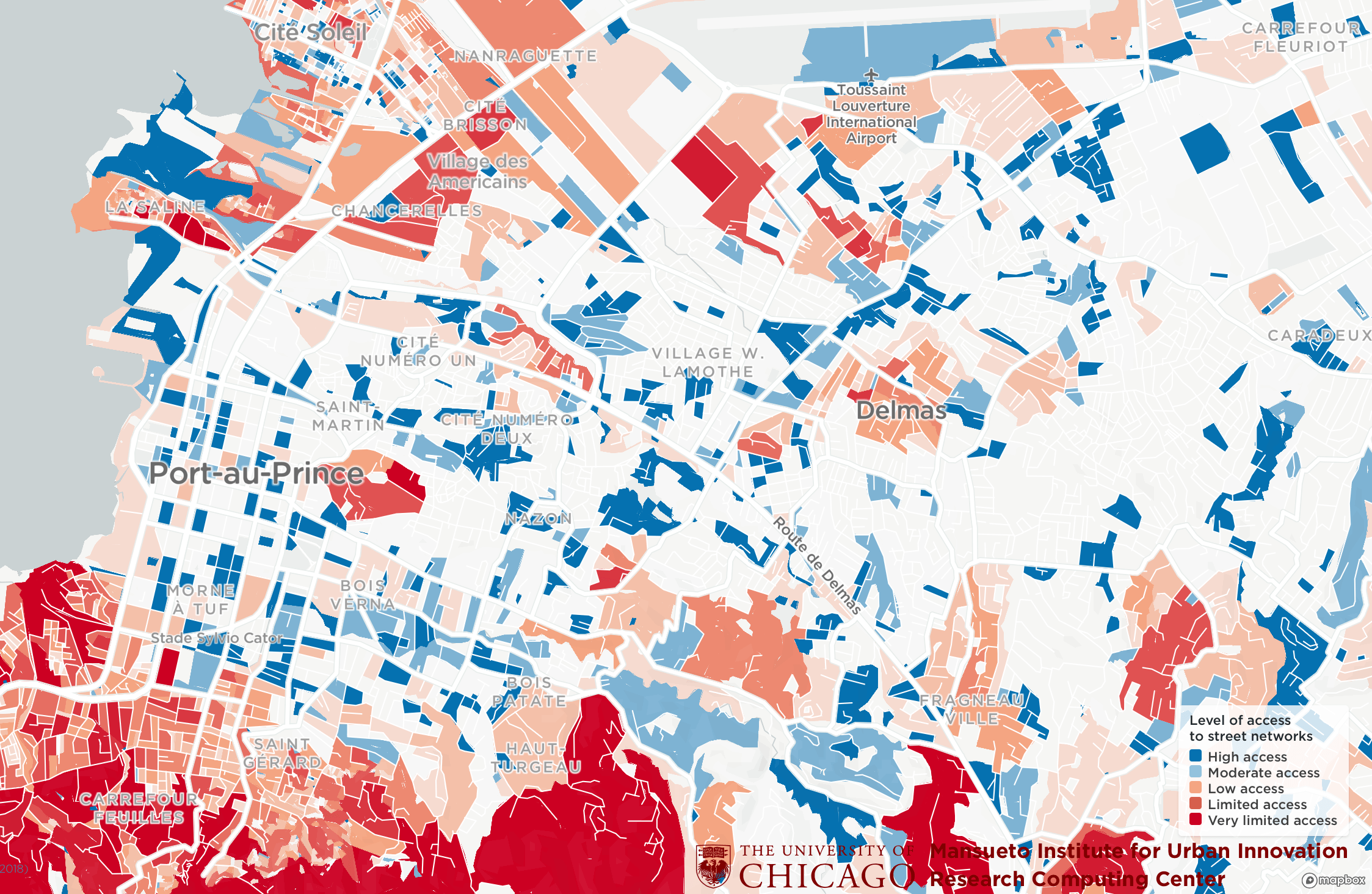
The Million Neighborhoods Map is a groundbreaking visual tool that provides the first comprehensive look at informal settlements across Africa, helping to identify communities most in need of roads, power, water, sanitation and other infrastructure. Updates...
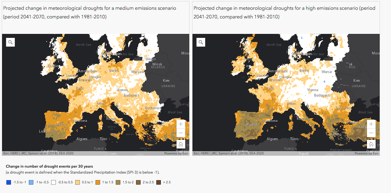
The European Environmental Agency has recently published a cartographic platform to map the impact of global warming on droughts, floods, agriculture, forest fires and sea level rise in Europe. These maps are based on...
The Atlas of Urban Expansion collects and analyzes data on the quantity and quality of urban expansion in a stratified global sample of 200 cities. With the aid of satellite images researchers have gathered a...
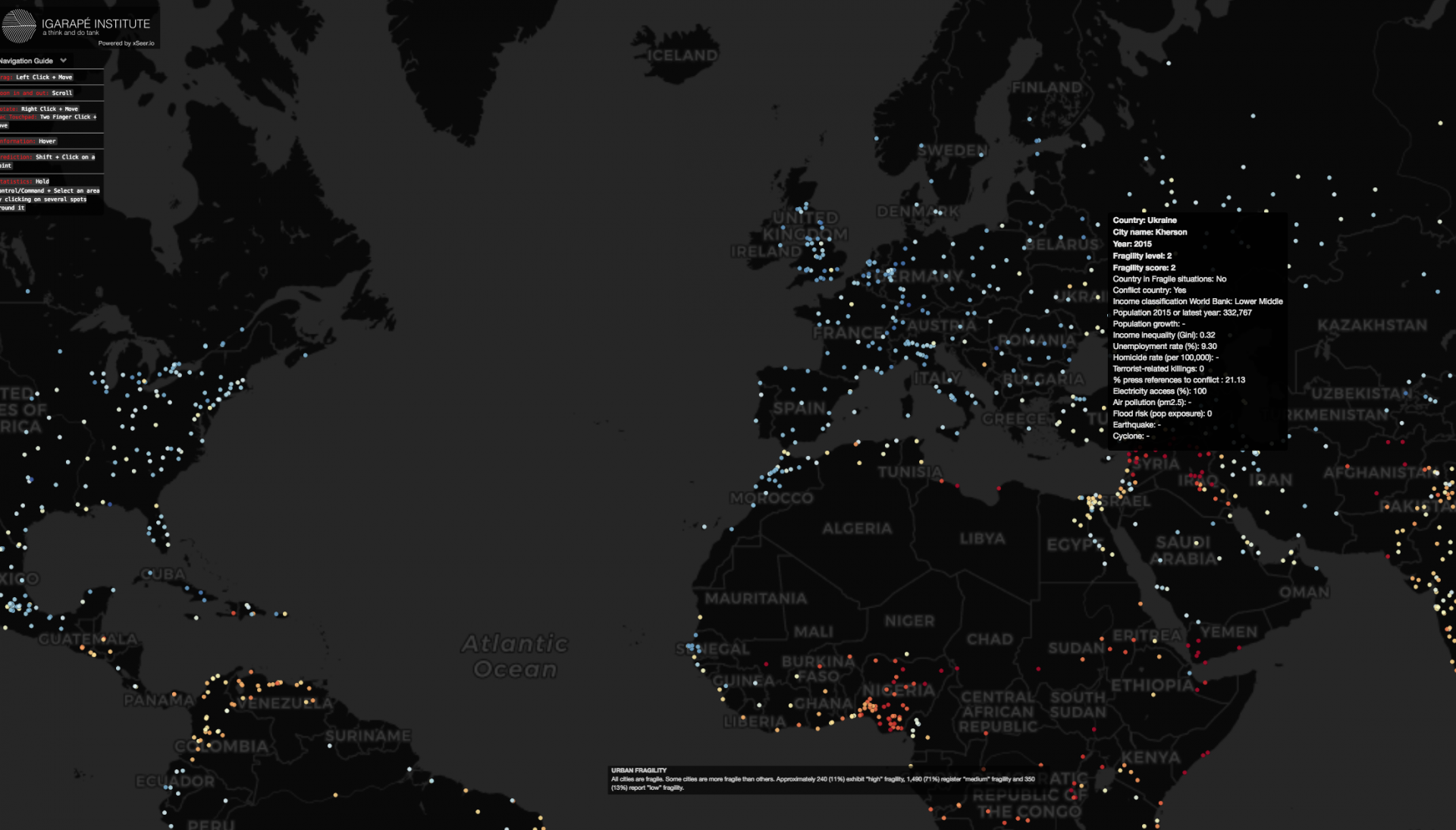
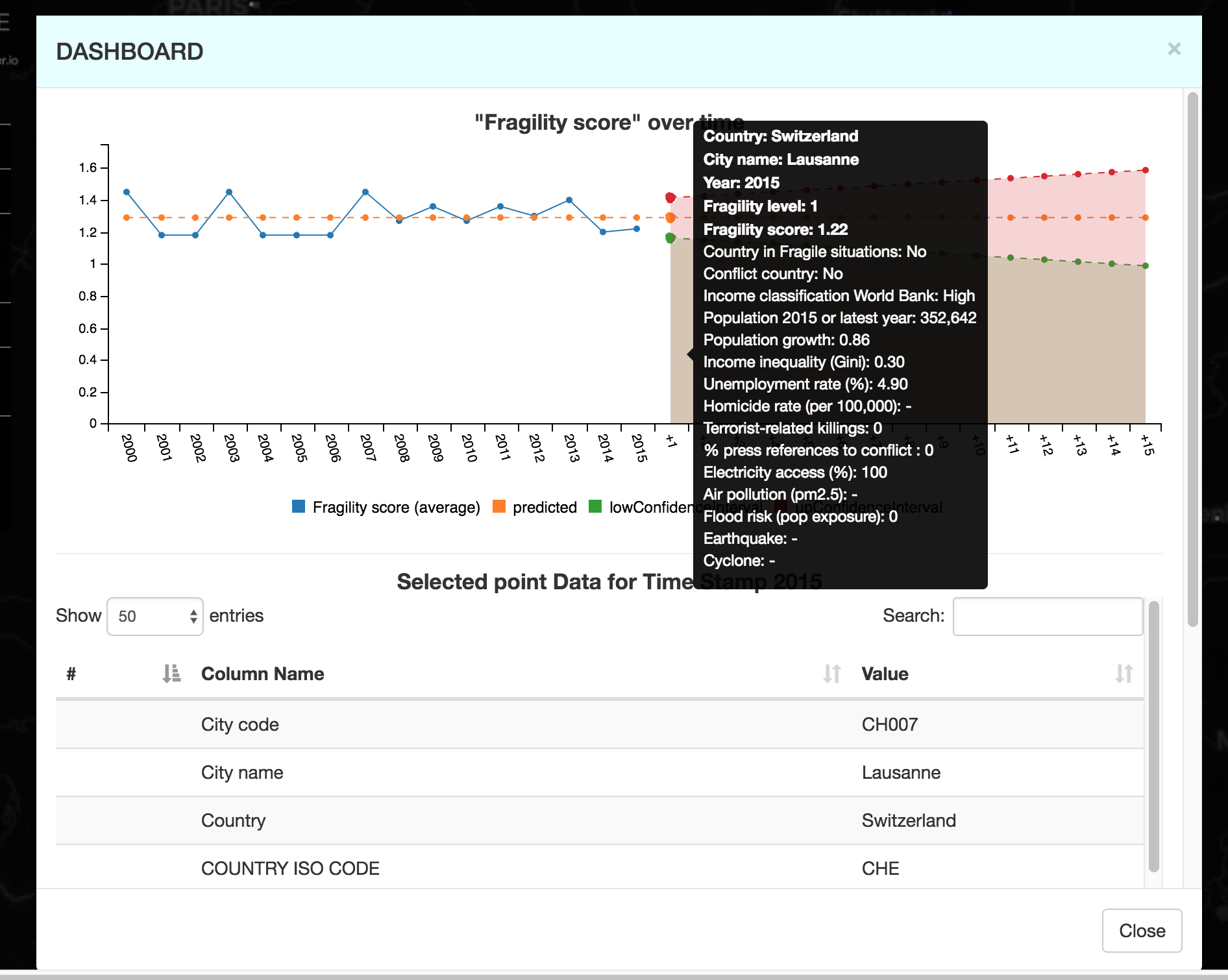
Launched in 2016 World Economic Forum in Davos from Igarapé Institute in collaboration with the World Economic Forum, the United Nations University, 100 Resilient Cities, XSeer and Canada’s Global Affairs, fragile cities is an...
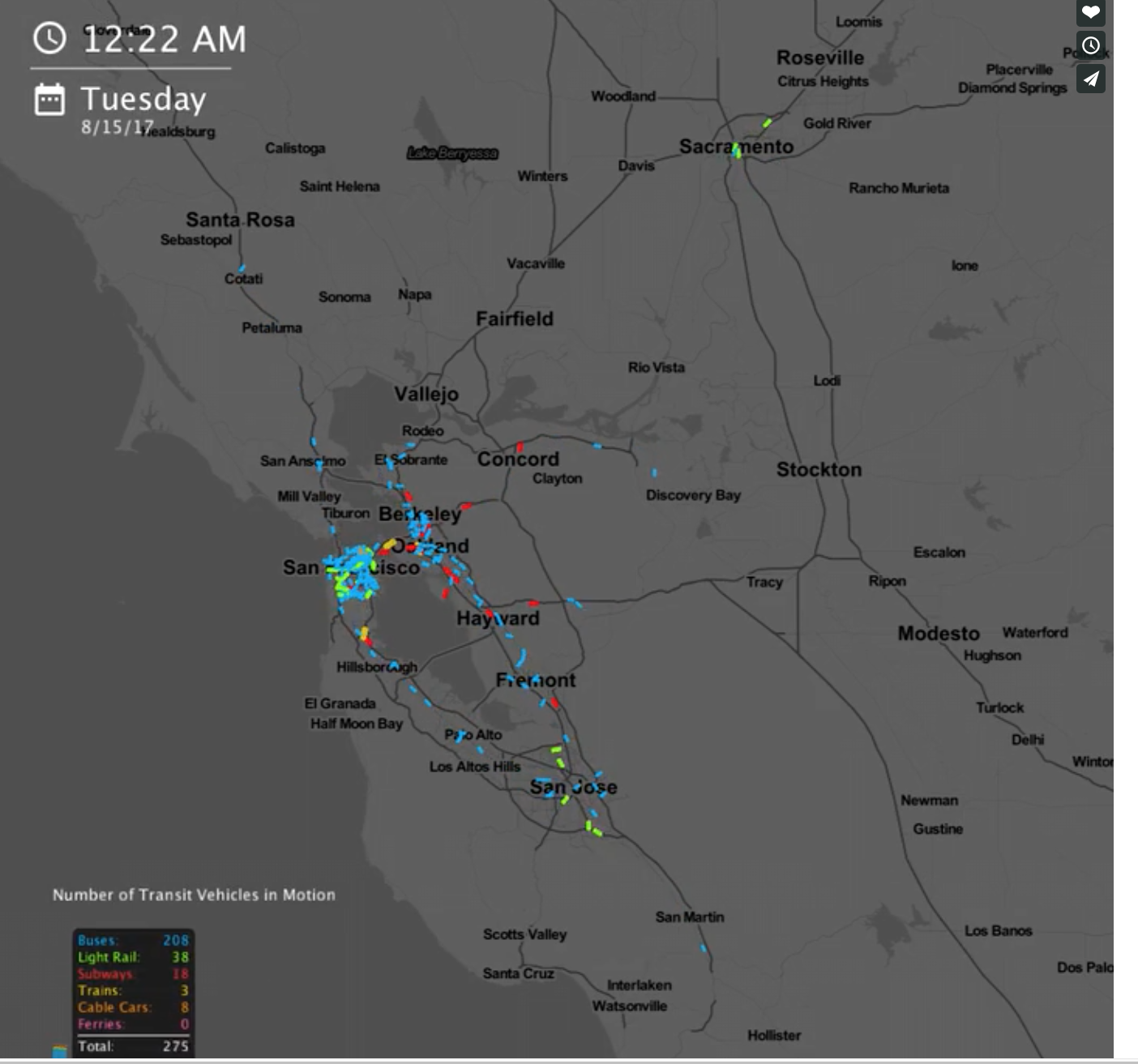
Columbia University student Will Geary created an instrument to visualize public transport flows through the 24 hours of the day. For example, below you can see an example of visualization for the San Francisco...
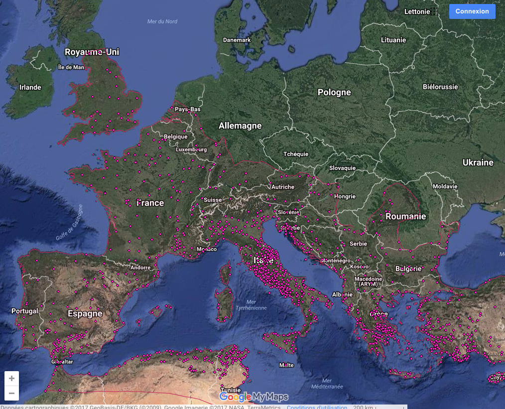
An interactive map of urbanism in the Roman world in the imperial period: ALSO OUT NOW: Hanson, J. W., (2016), An Urban Geography of the Roman World, 100 BC to AD 300, (Archaeopress)....
Interestingly…. they prefere parks and river sides :-(((( What a new information!!!! Where People Run
By Jaume Serra published in the “Courrier international” of January 2nd 2014
The Internet was supposed to let us bridge continents and cultures like never before. But after analyzing more than 10 million e-mails from Yahoo! mail, a team of computer researchers noticed an interesting phenomenon: E-mails...
The system calculates the distance from a city to another one, according to faster path, or lower cost. http://orbis.stanford.edu/ Go to “Mapping ORBIS”, It draws the path and create many different maps and graphs...
A website showing the proximities between sciences, between fields, maps of ontologies: http://www.science-metrix.com/OntologyExplorer/#app=cde1&8f8c-selectedIndex=2 http://www.science-metrix.com/OntologyExplorer/#app=cde1&8f8c-selectedIndex=1