Categories
Artificial Intelligence Cities Complexity Digital twins Geography Local digital twin MAPS Urban Vizualization

Digital twins for Amazon sustainability

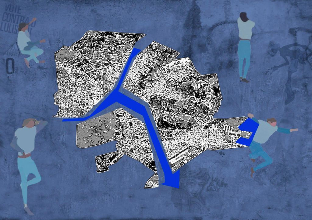
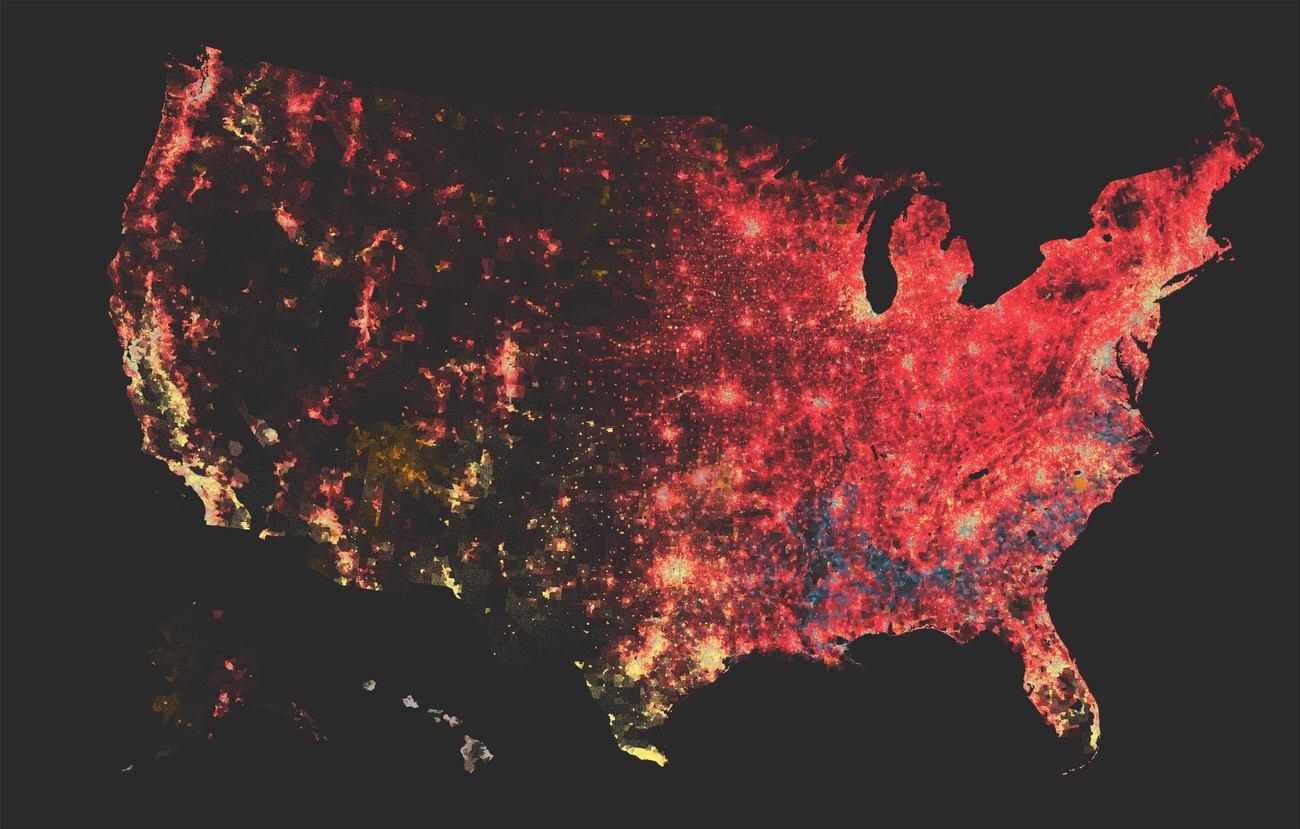
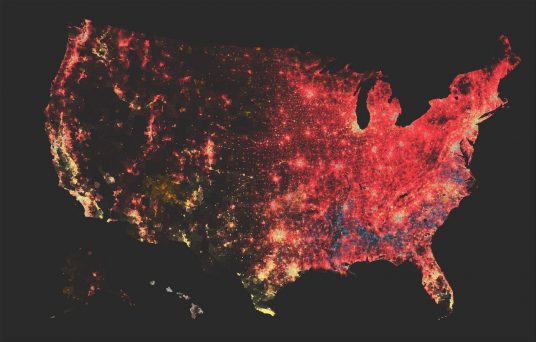
Carlo Ratti, director of MIT’s Senseable City Lab, and Robert Muggah, co-founder of the Igarapé Institute, recently argued in a Mongabay op-ed how digital twins could support policies to protect and conserve the Amazon while improving people’s well-being by encouraging them to expand green bio-economic activities.

They pointed out that digital maps can help understand the forest ecosystem in more detail than ever before. Using LIDAR and AI technologies, it may soon be possible not only to map and digitalize each individual tree from crown to root, but also to understand and scan how different species are connected to the surrounding topography and how each part of the ecosystem relates to the land around it – i.e. a complex approach-.

Digital twins can therefore help to clarify the relationships between rainforest ecosystems and the cities embedded within them. This includes complex and informal neighborhoods that remain unmapped. Based on this new amount of data and knowledge about the Amazon rainforest, it could be possible to help protect the ecosystem from environmental crime and unsustainable development by promoting and encouraging green alternatives.

Follow this link to read the full article:

https://news.mongabay.com/2023/11/can-digital-twins-help-save-the-amazon-commentary/

If you are interested in the activities of MIT’s Senseable City Lab, follow this link:

https://senseable.mit.edu/

And for the Igarapé Institute:

https://shorturl.at/FMO26


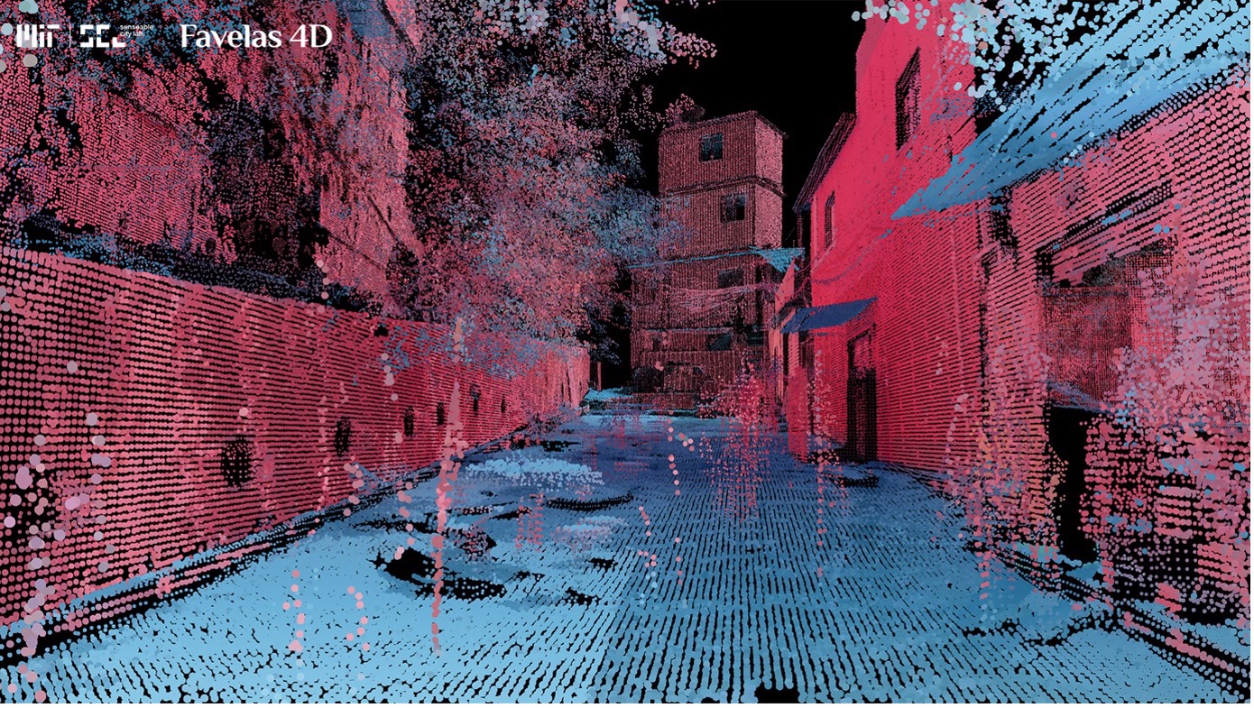
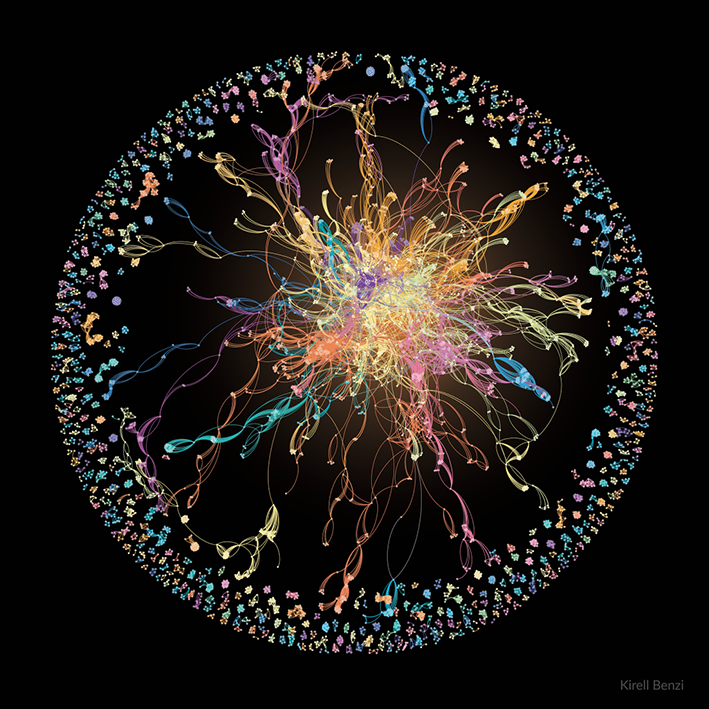
Image source: MIT Senseable City Lab.

Categories
Cities Complexity Economy Geography Networks Programming SCIENCE Simulation Vizualization

Cities in the face of green technologies, skills and preferences transitions – ECTQG 2023

At the European Colloquium of Theoretical and Quantitative Geography 2023 (ECTQG, 2023), Jorge Salgado – researcher at Citadyne – presented the progress of his research entitled: “Cities in the face of green technologies, skills and preferences transitions: a multilevel complex approach”. His agent-based modelling approach allows the simulation of changes in firms technologies and consumer preferences as a result of the green transition. The research has been well received because it simultaneously integrates key elements of the economic system, enabling bottom-up interactions to understand the reconfiguration of urban systems around the world.

If you are interested in this research you can contact Jorge Salgado: 

jorge.salgado@unil.ch

Categories
Cities Programming SCIENCE Simulation Urban Vizualization

A model-based spatio-temporal classification of global urban expansion  – ECTQG 2023

Dr Jingyan Yu, – postdoctoral researcher and member of Citadyne – presented the first results of her research “A model-based spatio-temporal classification of global urban” at the European Colloquium of Theoretical and Quantitative Geography 2023 (ECTQG, 2023).  She has developed static and dynamic measures to simulate urban expansion in Functional Urban Areas (FUA) around the world. She has found a global trend of physical spatial dispersion, producing discontinuous, dispersed built-up areas.

If you are interested in this research you can contact Dr Yu:

jingyan.yu@unil.ch

Categories
Geography MAPS Vizualization

Rayshader: An open-source software for the design of 2D and 3D maps

Dr. Tyler Morgan-Wall. It was recently used by Terence Fosstodon to illustrate the population density of the world’s countries in a clear, accurate and stunning set of maps.

You can read more about the tool here, or visualize Terence Fosstodon’s 3D maps on his twitter @researchremora.

Categories
Books Vizualization

Seven ways to visualize qualitative data

In this article you can find a comment on the 7th chapter of Jonathan Schwabish’s book  Better Data Visualizations: A Guide for Scholars, Researchers, and Wonks. From Icons through word clouds and coloring phrases, explore creative ways to get your message through mobilizing qualitative data in novel ways.

Categories
MAPS Networks Vizualization World

Measuring power relations in Asia

The annual Asia Power Index — launched by the Lowy Institute in 2018 — measures resources and influence to rank the relative power of states in Asia. The project evaluates international power in Asia through 128 indicators across eight thematic measures: military capability and defence networks, economic capability and relationships, diplomatic and cultural influence, as well as resilience and future resources.

The Index ranks 26 countries and territories in terms of their capacity to shape their external environment — its scope reaching as far west as Pakistan, as far north as Russia, and as far into the Pacific as Australia, New Zealand and the United States.

The project allows to choose different types of visualizations, and one of the most interesting among them is the network visualization that shows how countries are connected through their economic, cultural, defence and diplomatic ties.

Categories
Environment Geography MAPS SCIENCE Vizualization World

The interactive atlas of climate change

The IPCC has recently published their sixth assessment report on the physical evidence of climate change. The report has again confirmed evidence of climate change across all global regions, which will affect rainfall patterns, sea levels, exposure to extreme heat events. To better understand the impact of these changes across regions, the Working Group I has produced an interactive Atlas that allows to visualize the geographical impact of different climate change scenarios. Climate change is here, and it is crucial to comprehend its varying geographical impact, so this is a very welcome tool to help researchers and policy makers in this task.

Categories
Books Cities Communication Economy Graph analysis History MAPS Misc Networks Resilience SCIENCE Social network Social science Society Vizualization World

Handbook on cities and networks

Edited by Zachary P. Neal, Associate Professor, Department of Psychology, Michigan State University, US and Céline Rozenblat, Professor of Urban Geography, Faculty of Geosciences and Environment,Université de Lausanne, Switzerland

Publication Date: 2021 ISBN: 978 1 78811 470 7 Extent: 672 pp

If you want to understand cities – the innovation and dynamism they generate and the way they sort and segregate people by class, race and other dimensions – you have to start by understanding that cities are networks. Zachary Neal and Céline Rozenblat have done all of us who care about cities a great service by pulling together the very best and brightest thinkers on cities and networks in this terrific volume.
– Richard Florida, University of Toronto, US and author of The Rise of the Creative Class and The New Urban Crisis

This Handbook of Cities and Networks provides a cutting-edge overview of research on how economic, social and transportation networks affect processes both in and between cities. Exploring the ways in which cities connect and intertwine, it offers a varied set of collaborations, highlighting different theoretical, historical and methodological perspectives.

International contributions assess the state of the field of network analysis, presenting interdisciplinary insights that draw on theory from geography, economics, sociology, history, archaeology and psychology, and outlining methodological tools that include ethnographic, qualitative and quantitative approaches. Illustrating a framework for integrating the diversity of urban networks, the Handbook demonstrates that by exploring urban networks with different combinations of levels and scales, new insights and opportunities can emerge.

Featuring focused studies on specific regions and cities, this state-of-the-art Handbook is essential reading for scholars and researchers of urban studies and regional science, particularly those focusing on the transformation of cities as connected spaces through intracity and intercity networks. Its core theoretical insights will also benefit graduate students in urban studies and network analysis.

Categories
Art Cities Resilience Vizualization

Resi-city: art, cities, resilience

Credits: resi-city.com

What is the meaning of a map? Is it an objective tool or a representation of values? “H. Mazurek invites us to compare the points of view of the geographer as opposed to the cartograph. The author argues that the first one should overcome a cartesian vision and engage in the construction of spaces where territoriality and human behavior are intrinsically linked. Through a critical approach of how maps should represent the true meaning of places and their historical scope, this publication reminds us that spaces are social constructions and indirectly questions the significance of humanitarian mapping. “

“The below “virtual” collage is inspired by PCdO Campos & I Paz study (12) on the mapping of Itaperuna, Rio de Janeiro, BR. In January 2020, the worst floods registered since 1932 impacted dramatically this urban area. The map itself shows the flood occurrence of the Muriae river during the event. The study used highly skilled techniques based on fractal analysis investigating the (lack of) drainage performance and its impact on flooding cartography usage. Confronting the absolute objectivity of sophisticated measurements to the inherent subjectivity of human behavior translates here into a deconstruction-reconstruction process of the mapping. Itaperuna looks fragmented in three parts, but together with the river and its redesigned flooding, they constitute an indissociable whole and an integral part of the social space. All around, silhouettes are talking, lying down, dancing or listening on a background of graffiti, a way to recall the challenge of pedagogy when teaching to non-expert citizens the meaning of urban resilience.”

More info here

Categories
Cities Communication MAPS Social science Society Vizualization

Data Journalism and the increasing mobilization of data in public debates

The Covid-19 pandemic has contributed to the daily use of graphics, dashboards and visualizations that helped make sense of its spread and global development. Data are increasingly available and easy to manipulate and diffuse. Big data inform business decisions and policy-making but they play an increasing role also in journalism, higher education and in public debates overall.

The European Journalism Center, supported by the Google News Initiative, have released their second Data Journalism Handbook , an open access e-book that inquires into the foundations, practices and actors of data journalism. The way data are incorporated in public debates is changing the way news are told to the public. Social scientists are also increasingly using big data in their researches, and for these to be relevant to society it is important to be able to disseminate results and communicate them properly. This is why this e-book might also be of interest for academics that wish to communicate and diffuse their research findings.

(Here below: an example from chapter 2 and an application to ethnic segregation in the USA)

Dot-density population map of race in the United States from census estimates, 2018. Source: The Washington Post. https://www.washingtonpost.com/graphics/2018/national/segregation-us-cities/


Categories
Environment Geography MAPS Vizualization

Mapping electric networks and carbon intensity: how data can inform environmental choices

Where does your electricity come from? Does your country’s energy portfolio rely mostly on fossil fuels like coal and gas or renewable sources like wind and hydro-electric? The web platform electricity map allows to answer these questions and also to explore international energy exchanges. Besides, electricity map features a wind and sun layers that allow to assess the potential for renewable energy generation in real time!

Electricity map is a project of tomorrow, a Danish start-up.  Olivier Corradi, founder and CEO, explains the functioning of electricity map here: (video in French)

Categories
Cities Economy Geography Vizualization

Making beautiful data visualizations with RawGraph

Are you interested in data visualization and you would like to experiment with different charts? Then you might give RawGraph a go. This web-based application lets you import your data, choose between different charts to visualize it, customize it and export it in svg format, ready to publish or further improve.

RawGraph is now available in a 2.0 beta version, but help pages include examples and tutorials for the previous one, so if any problems arise in the version 2.0 you might want to begin exploring the older 1.0 version.

Using RawGraph 1.0 we generated an explorative bumpchart showing the evolution in the number of multinational’s firms inter-urban linkages (logged on Y axis) of different Large Urban Regions from 2010 to 2019. London, New York, Paris and Tokyo are unsurprisingly at the top positions. On the other hand, the performance of Wilmington Delaware would be surprising if we didn’t know that it is one of the world’s leading tax havens and corporate friendly locations. Chinese cities such as Shanghai and Beijing also show sustained growth while Moscow sharply decreases its foreign linkages most likely because of the effects of international sanctions following the Ukraine war in 2014.

Categories
Geography Society Vizualization World

The Atlas of Sustainable Development Goals: where do we stand?

The Atlas of Sustainable Development Goals 2020 presents interactive storytelling and data visualizations about the 17 Sustainable Development Goals. It highlights trends for selected targets within each goal and introduces concepts about how some SDGs are measured. Where data is available, it also highlights the emerging impact of the COVID-19 pandemic on the SDGs.

The Atlas draws from the World Bank’s World Development Indicators database, as well as from a wide variety of relevant data sources from scientists and other researchers worldwide.


Categories
Europe Geography Graph analysis Networks Social network Vizualization World

Navigating the supply chain network of strategic resources

The European Union has recently acknowledged the strategic role of a number of critical raw materials that are used in the ICT, energy and defense industry. As a result, the Joint Research Center of the European Commission has set up a Raw Materials Information Center that collects legal, economic, trade and policy data on strategic raw materials. A particularly interesting tool is the Supply Chain Viewer, that allows to visualize the global production network of a number of raw materials along with the countries of production and the sectors in which they are employed.

“The raw materials Supply Chain Viewer (SCV) provides an overview of networks of selected raw materials supply chains, consisting of supplying countries, material products, product applications, and economic sectors using such products and materials.

Conceptually, this type of data representation is forming a directed graph, i.e. a network consisting of nodes or vertices (four different types, namely countries, materials, applications and sectors) connected together. These connections (named either links or edges) are representing the flows associated to a specific material. More precisely, in technical terms, this is referred to as an acyclicconnected and oriented graph, i.e. a directed graph without multiple/symmetric edges or loops.[5]

Data for the linkages among countries, materials, product applications and sectors were selected mainly from the EC criticality assessment (CRM 2017)[1]. Such underlying data refer to the period 2010-2014. For several cases, where data were not reported in the CRM 2017, missing data were collected from BGS[3] or Eurostat[4]. On each link, a detailing popup displays the data source. In the SCV graph, data is comprised in the connecting links and not in the nodes, these being simply connecting points in the network[2].”

For more information, you can visit the project page.

Categories
SCIENCE Social network Vizualization

Connected papers: a tool for visualizing the scientific literature network

Network visualizations are a powerful way to make sense of the ties between social entities, and they have often been applied to the scientific network connecting researchers and disciplines. Most of the times, these networks have been constructed through citation analysis. Recently, a group of researchers and entrepreneurs from Israel have launched a new platform called Connected Papers where you can build a network around a paper of your choice. A tie between two papers is established not when they cite each other but when their reference overlap to a large extent. You can read more about their story and methodology here or on the application’s webpage.

Happy network building!


Categories
Cities Vizualization World

Readiness and response to Covid-19 crisis: how well have cities reacted?

The Covid-19 pandemic is highly affecting cities because population density favors virus diffusion. Cities are reinventing themselves in order to minimize chances of contagion while staying alive and functioning. A recently released UN-HABITAT platform evaluates how well cities have responded to and coped with the crisis, constituting an informative base for assessing containment efforts and designing upcoming urban policies.

“The web-based visual platform provides scoring for over 1,000 cities including, where data is available, cities with a population of 500,000 or higher along with country capitals and state/provincial capitals for the USA, Brazil, India, and China and allows for the addition of cities as data becomes available.

The COVID-19 Readiness and Responsiveness tracker for cities is a unique scoring mechanism that integrates a range of data points to provide a COVID-19 Readiness Score and a COVID-19 Responsiveness Score on a scale of 0-100.

The Readiness Score is based on five core indicator areas: public health capacity, societal strength, economic ability, infrastructure, and national collaborative will. Meanwhile the Responsiveness Score is based on: spread response, treatment response, economic response and supply chain response. The input data is normalized to provide comparison between cities.

The tracker, available at https://unhabitat.citiiq.com/ is powered by the CitiIQ platform which is capable of sourcing, translating and communicating both the Readiness and Responsiveness scores of cities.”

What do you think of this visualization tool? What dynamics does it help to illuminate? What other sources might be integrated into score measurement? Have a good exploration!

Categories
Graph analysis Social network Vizualization World event

Research on Covid-19: mapping scientific communities and their connections

What scientific literature is being produced and by which different scientific communities on the Covid-19 pandemic? Never before has scientific information been so quickly and widely produced, having a strategic impact in the public response to the Coronavirus crisis.

A group of researchers at the Institute of Complex Systems in Paris have produced an interactive visualization platform in order to map the scientific connections that are emerging around Covid-19. Using the online text mining platform Gargantext, developed within the same institute, they could feed the program a large number of scientific articles that have been analyzed in search of recurring patterns of word co-presence. You can check their work here.

“These maps has been realized using Gargantext from a PubMed Corpora with query “covid-19 OR coronavirus” on April 29 2020 (7.2k documents from Jan 2020 to April 28 2020). The methodology is described here

When you click on a term, the most related terms are displayed in a tag cloud on the right along with the Publications from PubMed that mention the most the selected terms.

In the Conditional map (the first map to be loaded), links between terms represent the conditionnal probability of having one terms knowing the other in a paper (its the confidence measure). It capture the interaction of terms within the document. This map depicts well the different communities working on covid-19 with their own research angle : biological mechanisms, diagnostic, treatments, social consequences, exposure of the elderly, etc. Node size in this maps reflect the degree of the node.

In the Distributional maps links between terms capture a proximity measure that takes into account the profiles of interaction of each term with the others. It can infer relevant relations between terms even if their haven’t co-occur in a paper (second order proximity measure). Node size in this graph is a fonction of the pagerank of the term in the graph.

The mathematical formula of these proximity measure can be found in the Gargantext documentation. “

Categories
Art Graph analysis Networks Vizualization

“L’art trouble, la science rassure” – Bringing art and network analysis together

Kirell Benzi is a data artist, speaker and data visualization lecturer. He holds a Ph.D. in Data Science since 2016, which he obtained at EFPL (Ecole Polytechnique Fédérale de Lausanne).

Building on very heterogeneous datasets (collaborations between musicians, patents, corporate links and much more) Kirell created a number of artistic network visualizations in which the insights from data are powerfully supported by the strength of the representation.

Please visit his outstanding network art gallery at: https://www.kirellbenzi.com

The featured image shows the network of Montreux Jazz musicians:

“This network shows with whom musicians of the festival play with, revealing two different categories of artists. At the border of the ring, we have the artists who only perform with their band, forming many disconnected communities. On the opposite, those who jam with everyone, the stars of the festival, are well-connected and are naturally located in the center of the ring. One of the brightest stars was George Duke, the champion of appearances at the festival with 53 concerts. In the center in orange, he faces the legendary guitarist Santana in purple.”


Categories
Geography Simulation Social network Vizualization

An agent-based simulation of coronavirus diffusion

As the coronavirus pandemic continues to spread across the world, governments are taking measures to slow down the spread of the contagion among the population. In fact, while there is no way the virus can be stopped altogether, it is crucial to slow down its diffusion in order no to overload hospitals and intensive care units.

Journalists of the Washington post have created an agent based simulation  in order to explain the importance of social containment measures in which agents, represented as moving dots, move into space getting infected, transmitting the disease and recovering. The four different simulation scenarios  — a free-for-all, an attempted quarantine, moderate social distancing and extensive social distancing — show that when restrictions to the movement are implemented the contagion curve clearly flattens out, while if the agents are left unrestrained the curve of infected people grows exponentially.

This timely piece of data journalism shows the importance of social distancing during this unprecedented global pandemic and interest and the potential of agent-based models to illustrate social dynamics in space.


Categories
Cities Environment Geography MAPS Vizualization

The Atlas of urban expansion- how do cities grow?

The Atlas of Urban Expansion collects and analyzes data on the quantity and quality of urban expansion in a stratified global sample of 200 cities. With the aid of satellite images researchers have gathered a rich dataset on built-up areas and the associated land use regulations and policies that sheds light on the process of expansion of urban peripheries since 1990. Besides, for a sample of 30 cities, researchers gathered historical data on urban expansion from 1800 to 2014 and used it to generate visually appealing animations that show intuitively the process of urban growth. See, for example, the animation of Los Angeles below.

The Atlas of Urban expansion is a joint initiative by NYU Urban Expansion Program, the Stern school of Business at NYU in partnership with UN-Habitat and the Lincoln Institute of Land Policy.

The Atlas can be freely downloaded, and a number of urban data, maps and metrics can be also downloaded.