Are you interested in data visualization and you would like to experiment with different charts? Then you might give RawGraph a go. This web-based application lets you import your data, choose between different charts to visualize it, customize it and export it in svg format, ready to publish or further improve.
RawGraph is now available in a 2.0 beta version, but help pages include examples and tutorials for the previous one, so if any problems arise in the version 2.0 you might want to begin exploring the older 1.0 version.
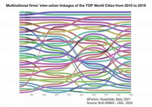
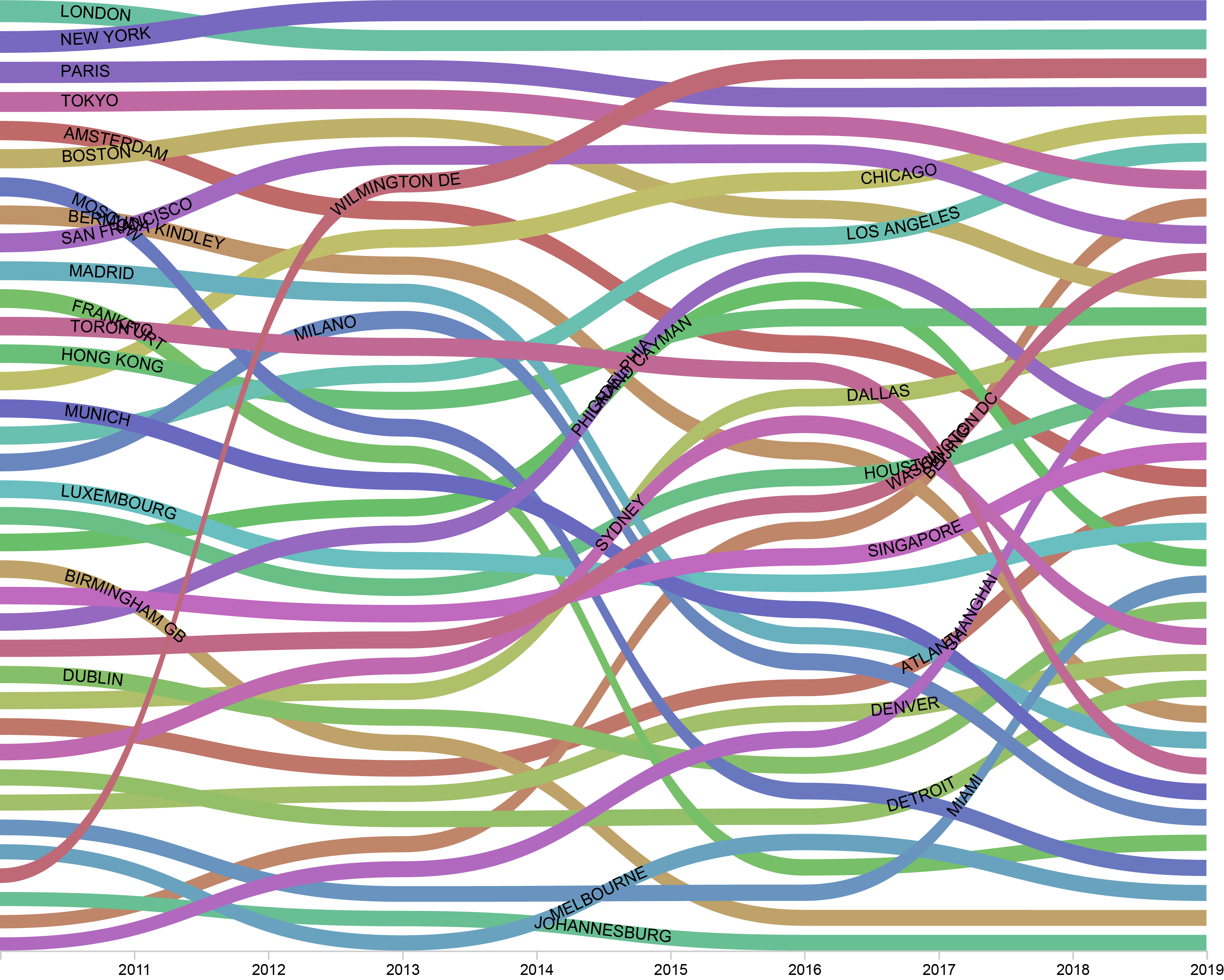
Using RawGraph 1.0 we generated an explorative bumpchart showing the evolution in the number of multinational’s firms inter-urban linkages (logged on Y axis) of different Large Urban Regions from 2010 to 2019. London, New York, Paris and Tokyo are unsurprisingly at the top positions. On the other hand, the performance of Wilmington Delaware would be surprising if we didn’t know that it is one of the world’s leading tax havens and corporate friendly locations. Chinese cities such as Shanghai and Beijing also show sustained growth while Moscow sharply decreases its foreign linkages most likely because of the effects of international sanctions following the Ukraine war in 2014.