Categories
Cities Geography MAPS Vizualization

Measuring cities’ fragility: an interactive mapping tool.

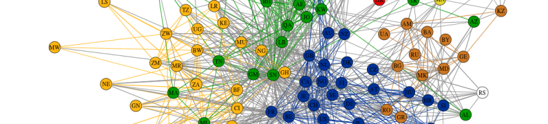
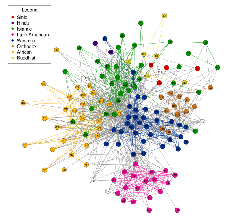
Launched in 2016 World Economic Forum in Davos from Igarapé Institute in collaboration with the World Economic Forum, the United Nations University, 100 Resilient Cities, XSeer and Canada’s Global Affairs, fragile cities  is an interactive tool that allows to visualize cities in terms of their fragility. The platform includes information on over 2,100 cities with populations of 250,000 or more. Cities were graded across 11 variables at the urban scale including population growth, inequality, unemployment, access to electricity, pollutions, exposure to terrorism, homicide rates and reported conflict events.and given a score between 1 (low fragility) and 4 (high fragility).

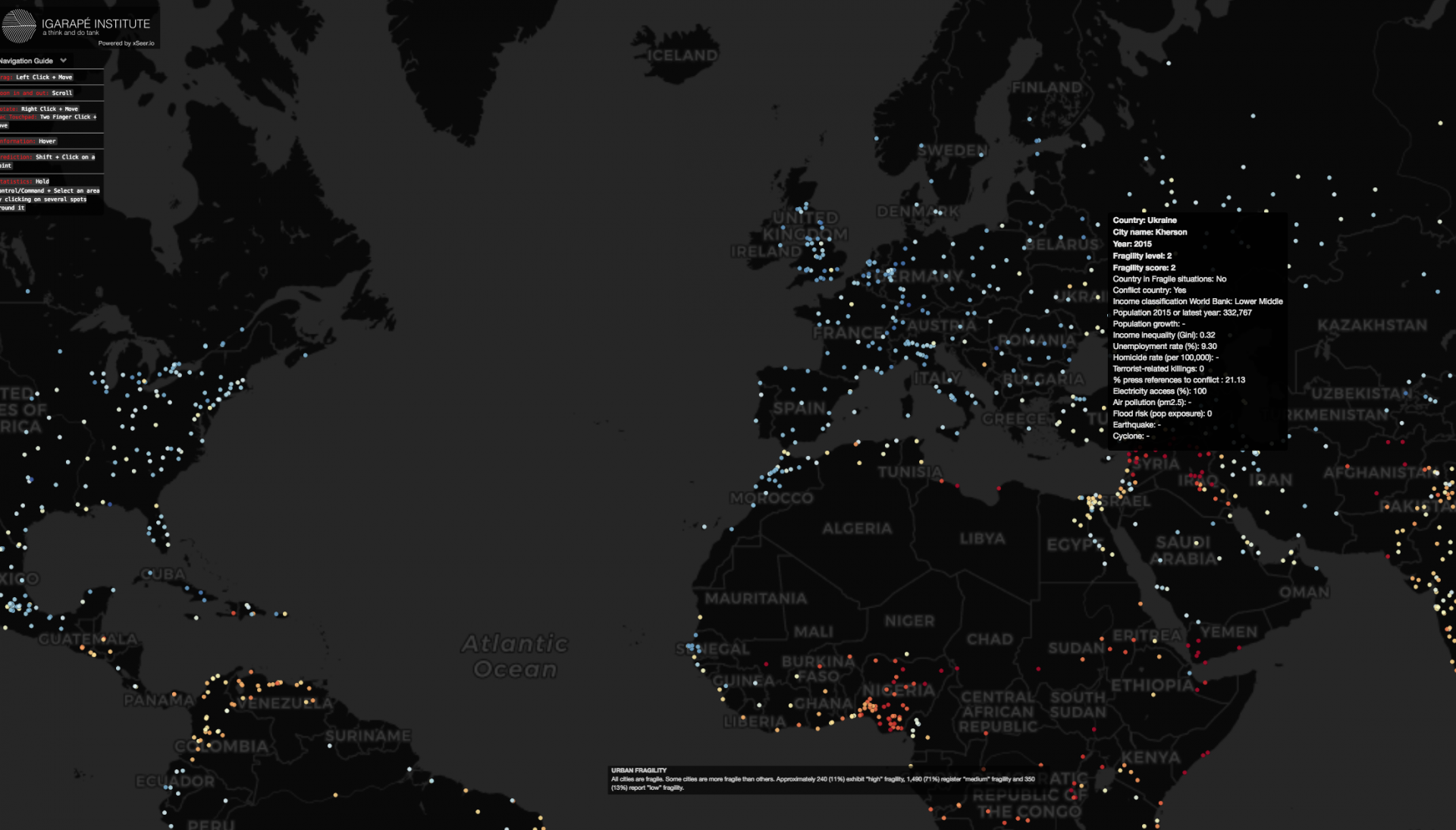
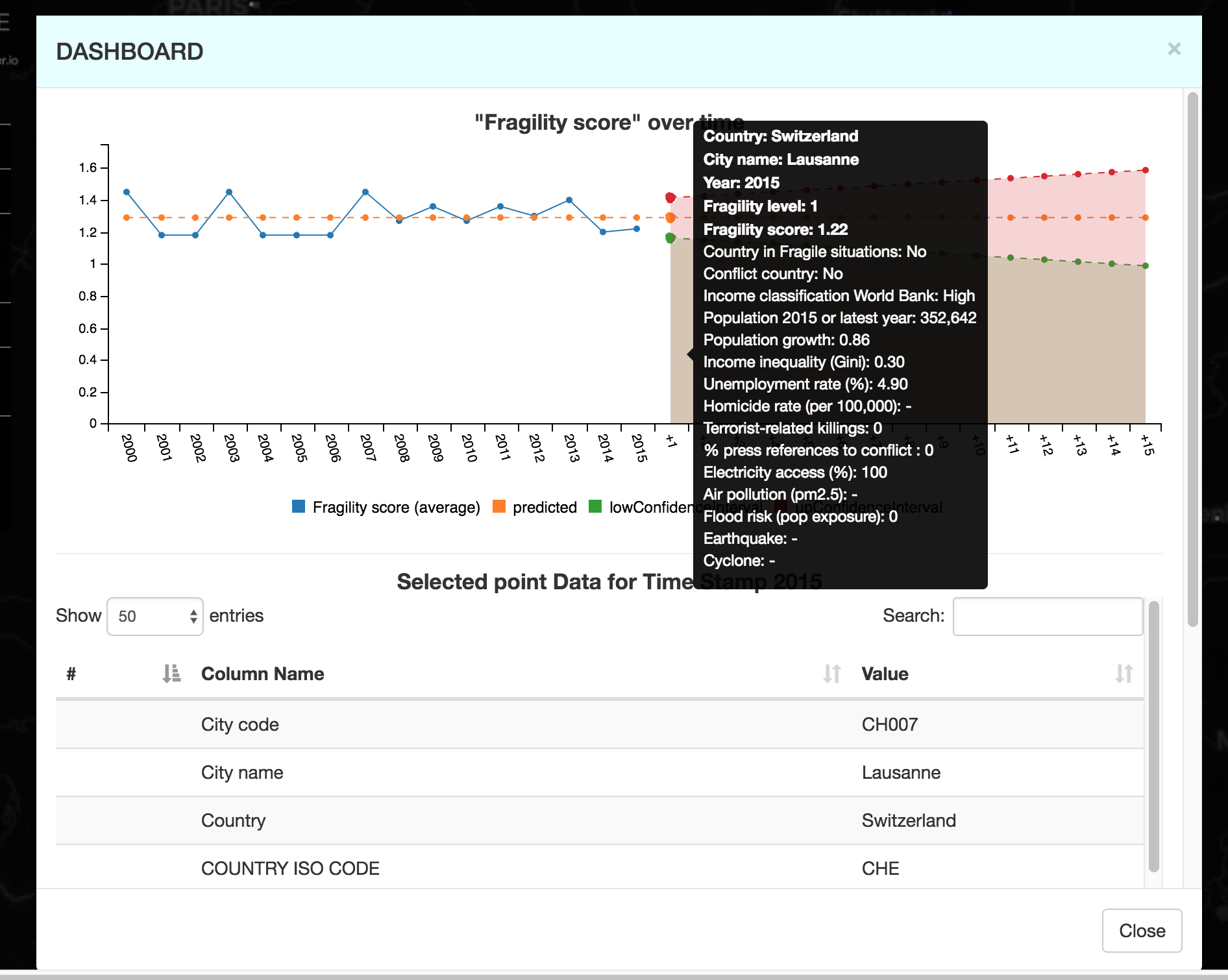
Besides, the evolution of urban fragility parameters in the period 2000-2015, and projections for the future, can be reconstructed by clicking on the dots.Below you can see, for example, the evolution of the fragility index for Lausanne:

Albeit cities’ fragility can be argued to be a much more multidimensional and complex concept, fragile cities is an interesting exploratory tool which could be useful to address issues of urban resilience.

Further information can be accessed here.


Categories
Cities Geography MAPS Vizualization

Transitflow: visualizing public transport routes in space and time

Columbia University student Will Geary created an instrument to visualize public transport flows through the 24 hours of the day.

For example, below you can see an example of visualization for the San Francisco Bay Area, in which small colored dots represent each a different mean of public transport (bus, subway, train, ferry..)

Want to know more?

Here you can get detailed information on how these maps where made and get the tools to create your own visualization for the city you’re interested in.

Categories
Cities Economy Misc Networks Social network Vizualization World

The Multipolar Regionalization of Cities in Multinational Firms’ Networks

Rozenblat, C., Zaidi, F., & Bellwald, A. (2017). The multipolar regionalization of cities in multinational firms’ networks. Global Networks, 17(2), 171-194.

Preprint paper

Categories
Cities Economy Misc Networks Research project SCIENCE Simulation Social network Social science Society Vizualization

CCS’15 & CS-DC’15 – Watching again the E-Session on Territorial Intelligence for Multi-level Equity and Sustainability

cropped-cropped-logo2

For those who missed the session Territorial Intelligence for Multi-level Equity and Sustainability, you can visualize online individually each presentation :

Denise Pumain, University Paris 1. ERC GeodiverCity (Keynote Speaker – Conference CS-DC)

World Urban Dynamics and climate change toward territorial intelligence for ensuring sustainability and equity by multi-level governance

Panos Argyrakis, University of Thessaloniki

Comparison of single and multiplex patent networks

Celine Rozenblat, Antoine Bellwald, University of Lausanne

Self reinforcement between urban firm’s networks at local and global scale: Comparison of single and multiplex patent networks

Elfie Swerts, ERC GeodiverCity

Scaling laws in Chinese urban system in light of harmonized data

Olivier Finance, University Paris 1 – CNRS

Scaling laws to explore innovative behavior of transnational investment

Paul Chapron, ERC GeodiverCity

Building and exploring systems of cities models via high performance computing

Denise Pumain, University Paris 1. ERC GeodiverCity

Scaling laws in urban evolution: A construction in territorial intelligence


The entire program of the TRACK “From Fields to territories to the Planet” is available here:

https://cs-dc-15.org/e-tracks/territories/

Categories
Cities Environment MAPS Misc Networks Society Vizualization

Where people run in major cities

Interestingly…. they prefere parks and river sides :-(((( What a new information!!!!

Capture d’écran 2016-02-03 a? 14.25.47

Where People Run

Categories
Mobility Networks Social network Social science Vizualization World

The global flow of people

Explore new estimates of migration flows between and within regions for five-year periods, 1990 to 2010. Click on a region to discover flows country-by-country.
Capture d’écran 2015-08-07 à 23.35.37
Categories
Communication Geography MAPS Networks Vizualization World World event

Map of the world of the most popular requests on internet 2013

By Jaume Serra published in the “Courrier international” of January 2nd 2014

Capture d’écran 2014-01-02 à 13.57.30

Categories
Art Cities Misc Vizualization

Wonderful New Year 2014

Carte voeux 2014_CITADYNE

Categories
MAPS Networks Social network Vizualization World

An incredible map of which countries e-mail each other, and why?

The Internet was supposed to let us bridge continents and cultures like never before. But after analyzing more than 10 million e-mails from Yahoo! mail, a team of computer researchers noticed an interesting phenomenon: E-mails tend to flow much more frequently between countries with certain economic and cultural similarities.

see the paper in Washington Post

original paper: State et al. 2013 World internet


email-chart

Categories
Cities Europe Geography Graph analysis History MAPS Networks Simulation Vizualization

ORBIS: the Stanford Geospatial Network Model of the Roman World

The system calculates the distance from a city to another one, according to faster path, or lower cost.

https://orbis.stanford.edu/

Go to “Mapping ORBIS”, It draws the path and create many different maps and graphs (in “Map gallery”). It’s a pity that the Emperors did not have this system 🙂


Categories
Communication MAPS Misc Networks SCIENCE Vizualization World

Science Metrix

A website showing the proximities between sciences, between fields, maps of ontologies:

https://www.science-metrix.com/OntologyExplorer/#app=cde1&8f8c-selectedIndex=2

Capture d’écran 2013-02-26 à 19.40.22

https://www.science-metrix.com/OntologyExplorer/#app=cde1&8f8c-selectedIndex=1

Capture d’écran 2013-02-26 à 19.41.16


Categories
Art Books Cities Geography Graph analysis Networks Vizualization

Art and Geography

Three years ago, a friend of mine who is a genius artist (Catherine Bolle), asked me to do geography on her biography. She told me many things about her life, during some few sundays afternoon in the Beaurivage Hotel in front of the lake in Lausanne. It took one year to build the data and think about the pictures to produce. Then to build them and interpret with a nice text.

C_ROZENBLAT_BOLLE_PARCOURS

IMAGE_BOLLE

Categories
Misc Social network Society Vizualization

What is wrong with social networking?

A conversation with scientist and inventor of the World Wide Web Tim Berners-Lee on what is wrong with social networking

Sir Tim berners Lee in DAVOS 2013

Categories
Art Economy Environment SCIENCE Simulation Society Vizualization World

Tomorrow’s world

A guide to the next 150 years

 by BBC news graphics

https://www.bbc.com/future/story/20130102-tomorrows-world

Categories
Cities Communication Economy Environment Geography Graph analysis MAPS Networks SCIENCE Simulation Social network Society Vizualization World

When Networks Network

The magazine Science underline the huge advance made in network analysis. Networks interact, create cascading effects……

read more in Science

Categories
Art Cities Environment Geography MAPS Misc Vizualization

Dissection of cities

I don’t know what we can learn from the physical dissection of cities: maybe some fractal analysis could work?

see the website

Berlin:

New York City:

and other cities in the website (made by Armelle Caron)

Categories
Cities Communication MAPS Misc Social network Vizualization

City of London during Olympic Games, maps of twitts

The density of twitter users shows the location of people in London during the Olympic games…. impressive……

See the website:

https://urbantick.blogspot.co.uk/2012/09/virtual-landscape-and-peak-for-london.html

London during Olympic games:

Other cities:

Categories
Cities Environment Geography MAPS Vizualization World

Remote sensing tracks relentless urban spread

Looking back through the decades, these snapshots from space — created exclusively for CNN by NASA’s Landsat department in collaboration with the U.S. Geological Survey — reveal the impact of the vast population shift on cities around the world.

https://edition.cnn.com/SPECIALS/world/road-to-rio/satellite-photos-urban-sprawl/index.html

example of LAS VEGAS:


Categories
Cities Geography Graph analysis Research project Simulation Social network Society Vizualization World

New Blog for the ERC project GeoDiverCity

https://geodivercity.parisgeo.cnrs.fr/blog/

Categories
Social network Society Vizualization

The political Blogs networks for the French President elections

A wonderful visualization of the active networks for french elections classified by partis:

see the website: