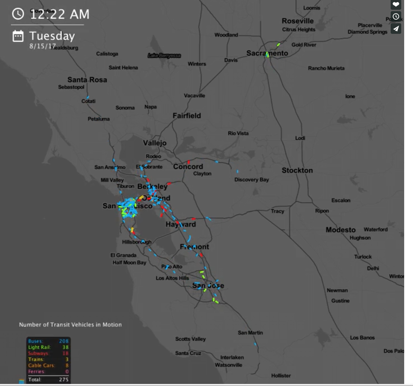
Columbia University student Will Geary created an instrument to visualize public transport flows through the 24 hours of the day.
For example, below you can see an example of visualization for the San Francisco Bay Area, in which small colored dots represent each a different mean of public transport (bus, subway, train, ferry..)
Want to know more?
Here you can get detailed information on how these maps where made and get the tools to create your own visualization for the city you’re interested in.