|
|

|
|
|
|
|
Facility News
The Last Month before Winter Holidays ❄️ ! A couple of weeks left and you can enjoy a much deserved break with your family and friends, so be brave !
|
|
The Flow Cytometry Facility (Biopole 3 and Agora/CHUV labs) will be officially closed from 6.00pm Friday December 23rd 2022 through to 12.00 noon on Tuesday 3rd January 2023. During this time there will be no FCF support or training, and no possibility to organize repairs as the service engineers from all companies are also on vacation until January 3rd 2023.
|
There will be no sorting service at either site from 6pm Friday December 23rd 2022 until 12.00 on January 3rd 2023. Please plan your experiments accordingly.
|
|
Analytical Flow Cytometers
|
|
All analytical flow cytometers will be available for use by experienced users with valid access cards in both the Biopole 3 (AA31 and BA32) and the Agora/CHUV (227 and 233) labs during this time. However, no staff will be available for troubleshooting or help with setting up experiments. Please only use the machines if you really need to. Bookings should be made as usual on the IRIS booking system.
|
|
In this month FACS Tips, we are especially focusing on tSNE, what it can and can't do for you and your data !
|
|
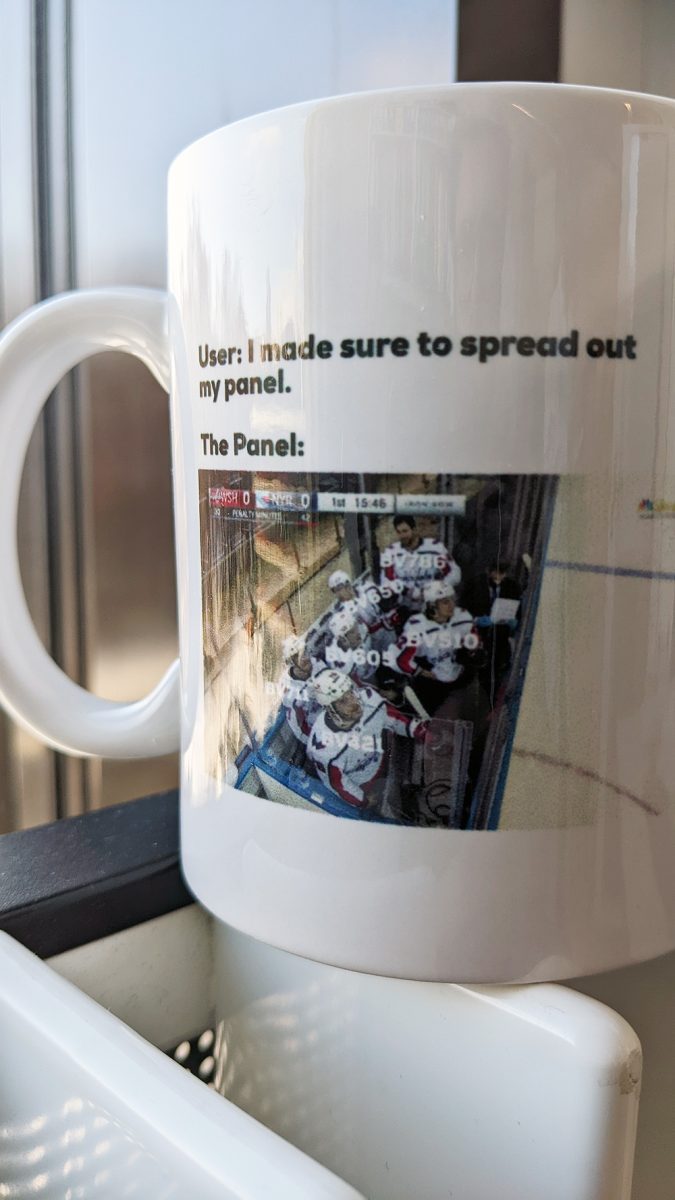
Last month Quiz was won by Laurie Bonneaux ! She won a Toblerone bar and the the exclusive mug of the month ! It might make you think twice about your panel design next time 😉
|
|
|
|
Each month, we will give away one of those special and unique mug designed by the FCF team so please take few minutes to answer the quiz HERE.
|
|
|
|
|
|
FACS Tips
|
What on earth is tSNE
|
This is a question I’ve asked myself many times as I look at what I can only think of as a Rorschach test for flow cytometry, where you can make up your own ideas about what you see like with ink blots on a piece of paper. This is not the case though, rather this is an algorithm developed to reduce and simplify all your markers down into one bivariate plot. When used correctly this is a very powerful data visualization tool as it can declutter a multi plot analysis down to one, and allow us to better focus on the outcomes and changes in relation to the various populations in our samples.
|
This stands for t-Stochastic Neighbor Embedding, and it is an algorithm that works by arranging high-dimensional data points in a bivariate plot so that events which are more closely related in variables are most likely to cluster near each other. For our purposes in flow cytometry, we can take our 100,000s of events, each with information for all our markers, and represent them in one 2D plane based on the events shared similarities. tSNE focuses on identifying subtle differences between more closely related events and neighbouring them in space, and is a preferred method in flow cytometry, because it has proven to better resolve populations which don’t stain brightly or discretely.
|
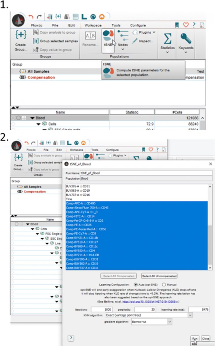
How to create a tSNE plot
|
|
It’s very easy to make a tSNE plot in FlowJo, I’ve put a basic outline of the steps below. Just select a sample and click on the Workspace tab. It’s best to clean out your sample of dead cells, doublets, debris, etc, before running the tSNE to avoid any influence of those events. Along the ribbon you will see a tSNE option, which you can select. First you will have to save your workspace and then it will ask you for your markers of interest. While it should autoselect all your compensated markers, make sure to update it to only select markers you are interested to have clustered. After some processing time, a bivariate plot with two tSNE parameters will be created. It will also appear underneath your sample in the workspace.
|
|
|
|
But what can it do for me?
|
However, just making the plot is only the first step, it alone doesn't add value to your experiment, rather we have to have an idea for what purpose we want the tSNE and what aspect of our data we think it may highlight. There are several different approaches to using the tSNE analysis tool. I’ll demonstrate a few examples below that may be of use.
|
|
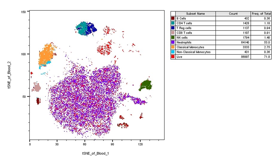
Manually gating and overlay
|
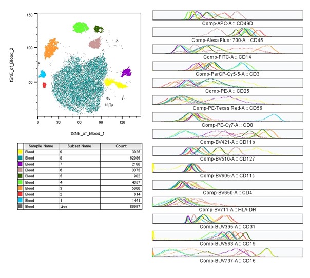
In the example below, I’ve manually gated through the sample to select all the populations of interest. Then, using the layout feature, I dragged the live cells population into the layout and set up the tSNE bivariate plot. By then dragging each population of interest over the tSNE, I can get a breakdown of each specific population on the overall tSNE. Using this method, I can see if there are any major clusters remaining that are not included in my populations of interest. In this case there is a small cluster of red events in the top center that don’t belong to any known population. We could now gate these and evaluate them further.
|
|
|
|
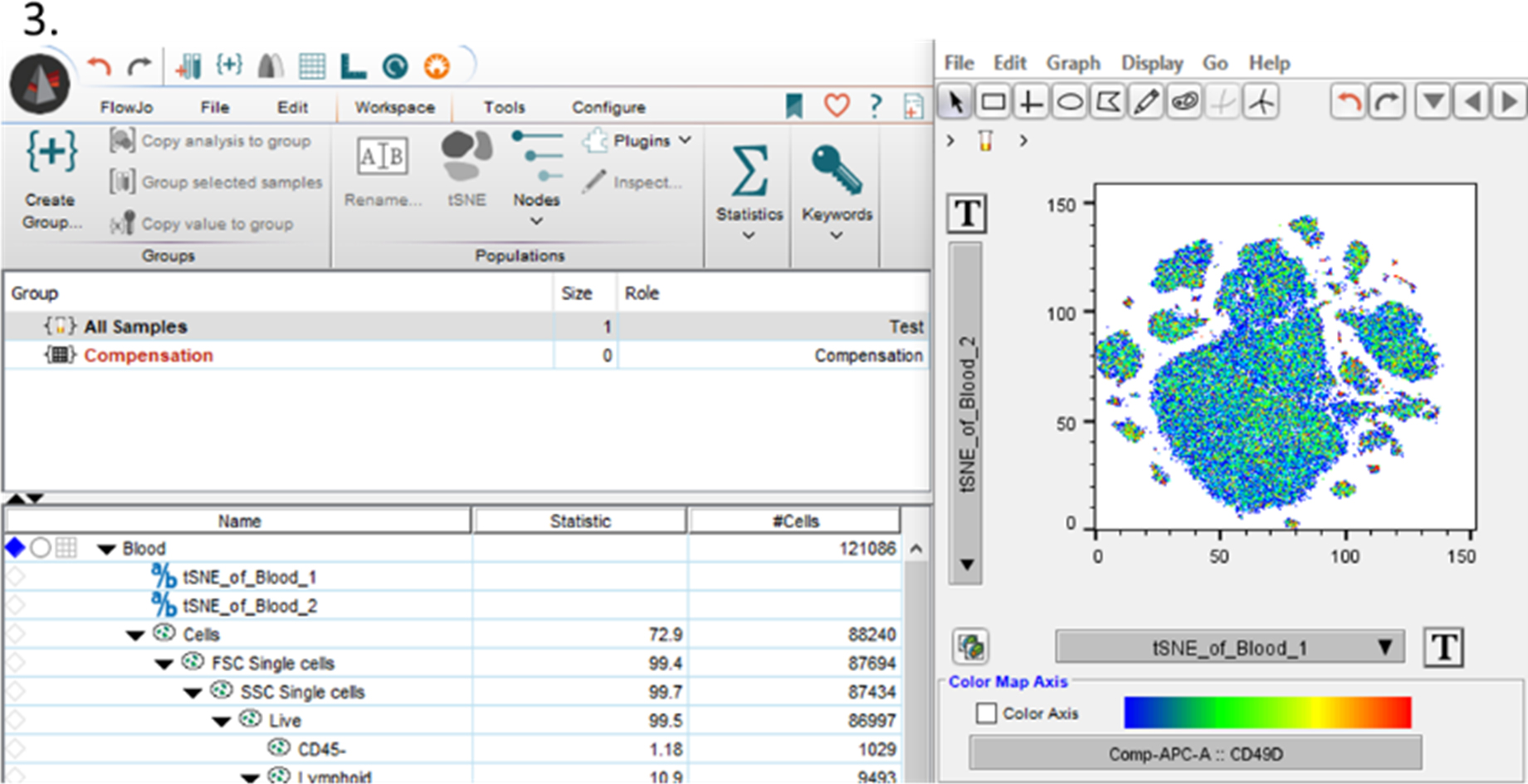
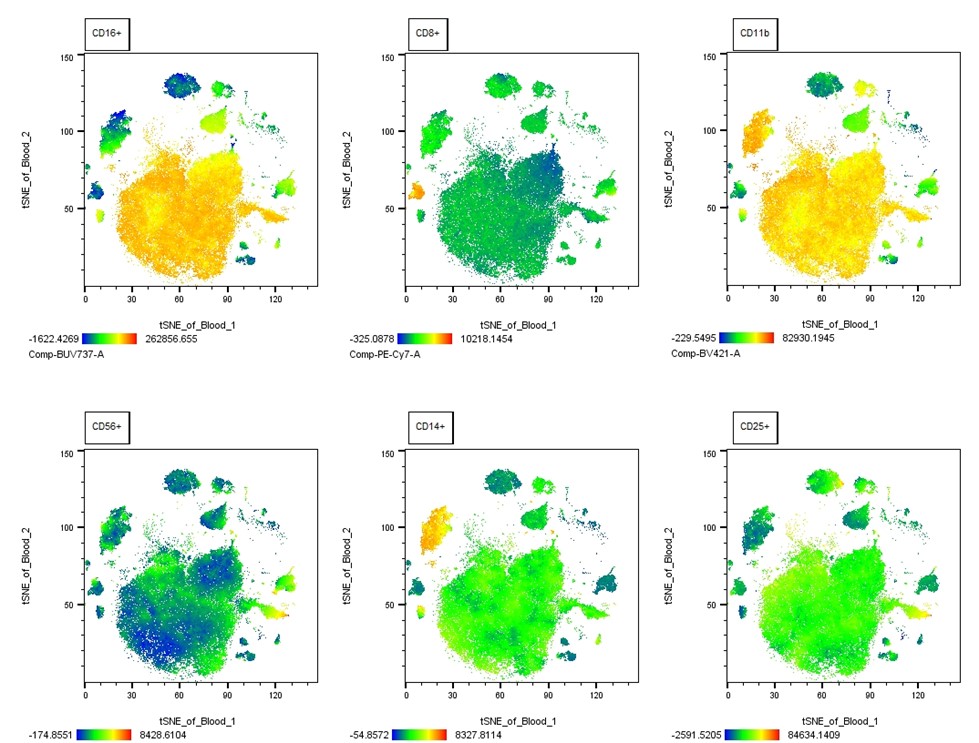
Instead of focusing on cell populations of interest making up the cluster, we can show the expression pattern of one or more markers of interest by heatmaps. As seen in the plot below, the same tSNE plot for our sample has been configured to show the heatmap statistic for several markers in the analysis. Although this would be too tedious to step by step explain here, it isn’t an overly complicated process. Simply, it just requires you to correctly scale the data for each marker of interest to minimize the whitespace and apply the heatmap statistic plot option, before moving the plots into a layout editor.
|
|
|
|
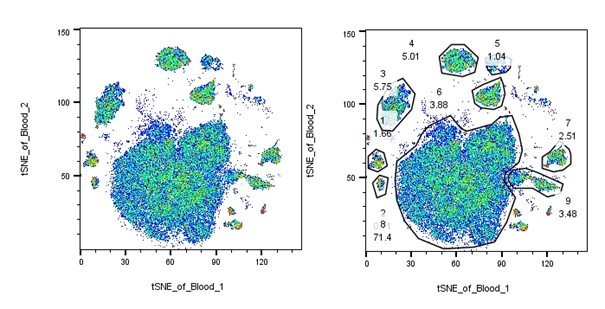
Lastly, you could just create the tSNE plot, then gate all the visible clusters without any pre-gating on populations or markers. From here it is possible to investigate the expression of all the markers of interest by histogram for each cluster. Although this probably isn’t the most efficient way to get your answer, it does make for a nice figure.
|
|
|
|
Unfortunately, tSNE analysis won’t necessarily fit all situations. Likely the greatest challenge you will have with tSNE is the algorithm can produce slightly different outputs on successive runs of the same sample, which can be confusing. This isn’t true for every data set, but was the case with the example data I’ve used here. What I mean by this is that the clusters should stay the same, but their position on the plot can shift. This also means that between samples the output will differ, making comparisons impractical. This requires you to concatenate your samples into one fcs file, and then separate them from there by using the SampleID keyword as a parameter. Both the distance between clusters and the relative size of the cluster may not have any relevance to your data. While the number of events of a population will to some degree influence the size and have meaning, the algorithm itself can manipulate cluster size and distance in a way that is not of value to your experiment, so it’s best not to make inferences on this information as it currently is done. When compared to conventional hand gating population subsets, such as central and effector memory t cells, defined by continuously expressed markers tSNE did not show great separation. Also, tSNE, because of its slow computation, may not lend well to very large data sets. If files are too big, FlowJo is likely to freeze or crash in the process of calculating. Overall, tSNE as it’s performed on FlowJo, requires a lot of behind the scenes “magic”, that results in a plot. However, it can be difficult to pull apart the reason why certain things happen the way they do without a computational mathematics background. If something feels too good to be true, it can be of value to get expert advice, rather than trust the algorithm blindly.
|
|
With ever expanding panels, the need to create complicated gating strategy diagrams can be confusing and distract from the main point we want our data to show. With tSNE, we can simultaneously reduce our parameters down to a single plot while maintaining the valuable information we want to display. Since there is flexibility in how tSNE can be visualized, it gives us a lot of options for our individual experiments. However, like with any machine learning process, care needs to be taken to work within the constraints of the algorithm and make sure that you know what you know and that any effect you’re seeing is real. As always feel free to reach out to the staff for any questions.
|
|
|
|
|
|
|